exhibition stand graphic design
Exhibition Stand Graphic Design: Creating Messages That Read from the Aisle
Cover: a topic-specific illustrative visualisation.
Exhibition stand graphic design has to work at more than one distance. A visitor approaching through a busy aisle first needs to recognise what the company offers. Once inside, they need useful product information and a clear next step. Treating every surface as a poster usually makes these tasks compete.
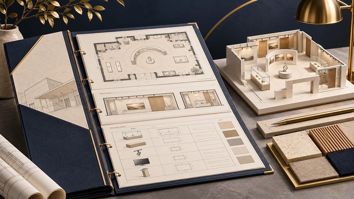
Start with the approved stand layout and a short message hierarchy. Graphic approval should happen with the architecture, equipment and production method visible—not as a final image added after the walls have been built.
Give the main message one clear job
Agree which product category, problem or benefit should make the right visitor stop. Keep that statement distinct from a slogan that only existing customers understand. The logo identifies the company; the main sentence explains its relevance; the product information supports the conversation. They do not all need the same size or position.
Put the proposed graphic into a photograph or accurate view of the aisle. Ask someone unfamiliar with the company what they think the stand offers. If they can name only the company but not its relevance, refine the message before adding more detail.
Review the layout from the actual approach
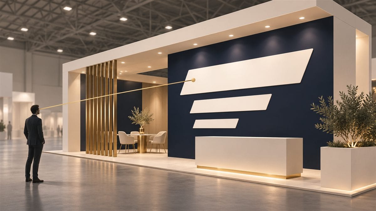
Consider the likely approach routes, the open sides and neighbouring sightline obstructions. A message above a display may read clearly from one direction and disappear behind a screen from another. Review text at the intended output size and viewing position rather than approving a zoomed-in design file.
Contrast, lighting and the printed surface affect legibility. Where a critical graphic uses an unfamiliar material or finish, agree a representative production sample with the printer instead of relying on a screen preview alone.
Build around joints, doors and working equipment
Request the final production dimensions for each graphic surface. Mark panel joints, doors, access hatches, sockets, ventilation, shelves, screens and fittings on the artwork template. Keep essential words, faces, logos and QR codes away from vulnerable cuts and joins.
Check the stand in its working state. A counter display, open storage door or stack of brochures can cover a message that appeared unobstructed in the rendering. On curved or interrupted surfaces, the producer must confirm how the artwork will be divided, applied and aligned.
Use a disciplined material and brand palette
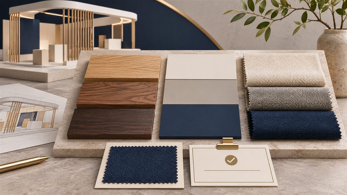
Match colour decisions to the brand files and the actual substrate. A colour on a backlit textile, painted panel and screen will not necessarily look identical, so review important combinations together. Establish which differences are acceptable and who gives the final approval.
The Bona Home HOMETEX 2026 project combines a defined material palette with digital display surfaces. Its photographs are a useful reference for discussing the relationship between architecture and brand communication. Your own message and artwork should still be developed around your product, audience and production specification.
Agree the print specification before final artwork
Ask the appointed producer or printer to provide the required output dimensions, bleed, safe areas, file format, colour workflow, image resolution and finishing details for each item. These depend on the chosen production process and viewing distance; do not apply a single guessed setting to every surface.
- Use the approved logo master and confirm that you have permission to reproduce all images and brand assets.
- Check language, spelling, product codes and contact details in the output-size proof.
- Confirm how fonts, linked assets and any outlined text should be supplied under the printer’s requirements.
- Give every surface a unique label that matches the stand plan and installation list.
- Test the actual QR destination and ensure it is useful to a visitor using a phone.
Make approval and late changes traceable
Keep one current artwork register with the surface label, file version, approver and production status. Distinguish a design preview from an approved production file. When the client changes a message after approval, identify which surfaces are affected and ask for the cost and schedule implications before printing again.
Provide the installer with labelled placement drawings and the approved visual reference. At handover, check that graphics are correctly oriented, joins are acceptable, access panels still work and screens show the intended content.
Bring graphics into the stand brief early
Send your brand guidelines, main message, product images, language versions, planned screen content and existing artwork together with the stand plan. Our custom stand design team can consider those elements alongside the structure and display functions. Request a project proposal with the required graphic production and installation scope clearly identified.